Apparently I wrote this blog when Flight of Light was launched way back in August 2017, but for some reason never published it. So here it is, looking back at one of the key aspects of the game’s evolution over its 3+ years development time!
Flight of Light was developed using an organic / evolutionary design method – At each stage of development, I took the work-in-progress game to a lot of different events and conventions. Allowing its design to be guided by feedback and suggestions from those who played it. During that process, one aspect of the game’s design came up time and again. In conversations with players, it’d usually go something like this:
“So, this game is all about matching colours?” Indeed. “Well actually, I’m colourblind. So how does that work for me….?”
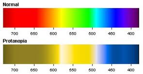
The above picture gives an approximate idea of how people with Protanopia – one of the most common types of colourblindness – see colours differently. About 1% of men are colourblind, with many more having some reduced range of colours they can easily distinguish between. So it made sense that when showing my game to 200 odd people over a weekend at a games convention, statistically at least, one player would be affected.
A quick search of the internet gives plenty of good advice and examples of how to adapt a game so that colourblind people are not at a disadvantage. However, due to the aforementioned organic game design method used for Flight of Light, once I started considering colourblindness, it actually had a deeper impact on the core game design itself.
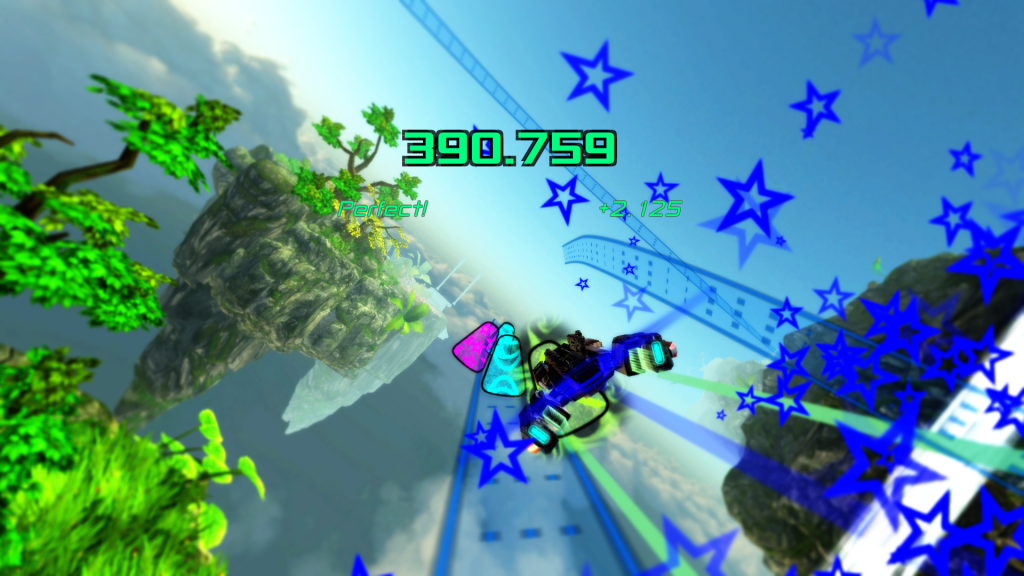
As the game looks today
Flight of Light is a rhythm game in which players travel on rails along a rollercoaster-style track, shifting from side to side in order to hit coloured objects coming towards them on the track. The objects hit in-time to the music/beat, and the closer the player is to hitting the objects dead-centre, the more points and bigger the speed boost they get. (Think Audiosurf but with motion controls).
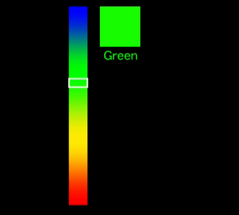
However, the game started off as something very different: Way back in the early stages of development, players would be given a colour that they would have to match, using a colour picker, within a time limit. The closer to the colour they where when the time ran out, the more points they earned. (In the picture below, the target colour is on the right. The bar on the left is the colour picker, with the white selector indicating the player’s current colour. The player would move the Wii Remote up and down to move the selector up and down the spectrum bar and so change their colour).
In the beginning…
This was problematic, as for colourblind players, two different colours could look identical, with no way to tell which was the “correct” one. The immediate solution was to only use colours that were easily distinguishable (for the most common types of colourblindness). So rather than use the RGB rainbow colour spectrum – red to green to blue, and whatever was in between – the game could use any colours and simply blend between them. Purple to yellow to blue to red for example.
However, the blend in-between colours were often a problem: Half way between, say purple and yellow could look very similar to half way between yellow and blue. When the game randomly selected one of these in-between colours as the next target to match, it caused confusion for all players.
Next idea was to design one special colour palette by hand, where everyone, including colourblind people, could unambiguously tell the difference between all the colours on the chosen spectrum. It worked great from a technical point of view. Colourblind players could play just like anyone else!
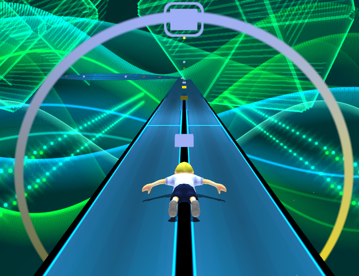
You can see the results below. (By now the bar had evolved into a colour wheel and the target colour into coloured blocks on the rollercoaster track):
Mustard blue and greyish-yellow.
Trouble was, colourblind players wanted to play the same game as everyone else. They didn’t want to be forced to play the “special” palette, as it just highlighted their disability, rather than taking it out of the equation. Moreover, colour-blind or not, people found the scheme I’d chosen downright ugly!
This became the catalyst for a series of design changes. Firstly, I flipped round how the colours the players were asked to match were selected by the game. Previously the game would have 3 or 5 colours, blend them together into a spectrum, then pick a random point along that spectrum.
Instead, the colours the players would have to match would only ever be the 3 or 5 or 8 pre-determined base colours, rather than the in-between colours.
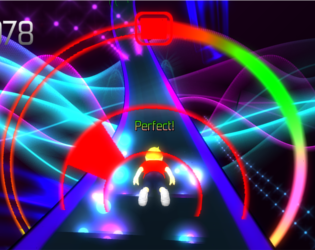
Initially, to keep the game challenging, and still use the continuous range of input from the Wii Remotes, the colour spectrum was retained, now as a colour wheel the player rotated around their avatar. However, the game continued to evolve. The blocks were replaced by coloured segments pointing to where they were on the colour wheel around the player (see below). And from there, the colour wheel was itself replaced, with the player’s avatar moving side to side to physically hit the coloured blocks.
Evolving the game
The game still has its issues: Players can customise the colours before a game, and each coloured object has a unique pattern to help distinguish it. But some of the default colour choices aren’t the easiest to tell apart, especially on hard mode, where there are 8 different colours in total.
Flight of Light had many different, quite separate influences. But undoubtedly it’s course was altered in no small part by considering the needs of colourblind players.

