(Epilepsy warning: Contains flashing images)
The tutorial system in Totem Topple is something that we’ve wrestled with over a number of iterations. In the launch version of Totem Topple, it worked, in the sense that it gave players enough of an understanding of how the game’s basic mechanics worked to be able to play. Similarly, the complimentary Help system worked well in allowing players to see the underlying stats and numbers for the various heads and enemies.
However, the fact that many players resorted to using the Help showed how much the game was lacking in visual feedback. Many of the minor changes made to Totem Topple for the 2.0 release try to give players a better sense of how their actions affect the game.
Circular Confusion
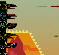
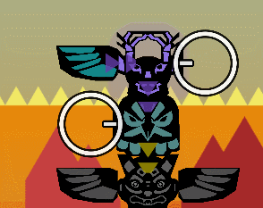
For example, some heads give a bonus to their neighbours, as indicated by the radius wheel behind them. Unfortunately, the wheel itself, whilst it is clear where it is coming from, it’s not clear what it actually does. There are no visible links or changes on the heads it affects. In fact, some players confused it for some sort of shield or radial attack.

Instead, now indicator arrows point between heads, wings and beaks, allowing players to see when any one element on the totem pole affects another. For health buffs, the affected heads gain a purple glow as a show of high strength, at least give some indication to the player that this head is different to others. However, we’re still looking at ways to make it even more obvious when one head or wing afftects the health of another.
Go Faster
When it comes to rate of fire changes, the differential between the lowest and highest rates was not big enough previously. Whilst the way the game was balanced, a higher rate of fire made a big difference to the player’s ability to kill lots of enemies, unless they looked really closely, players were unlikely to be able to tell that.
To improve this, firstly the balance of the game was changed so that low rate of fire really did mean one measly arrow every couple of seconds, whilst the highest rate creates an almost constant stream. Further to this, a higher rate of fire actually means the arrow physically moves faster. The arrows also gain “go faster stripes” or speed lines as they are called by illustrators. These emphasise the speed, but also give an extra visual pointer to show that things have changed when adding a wing, or that this head-beak combo is better than another.
Adding in a simple, two step animation of the bird beaks opening and closing every time an arrow fired also helped to give players an extra visual clue that one head/beak is a lot more active than the others. Especially so when arrows are flying in all directions.
There were also a few combinations where beaks would have a zero rate of fire or arrows would do negative damage. To represent this, beaks would be closed, or fire broken arrows. Even so, this is probably a bit confusing for the player, so long term, we’re aiming to remove the need for these by rebalancing.
![]()
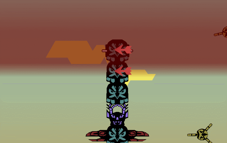
Flaming Arrows
For damage, arrows now start off black and then slowly turn more and more brightly coloured depending on the damage type being fired. The highest damage dealing arrows are then given spectacular trails of flame, snowflakes or water jets to really drive home that these arrows were specially powerful.
Differentiation
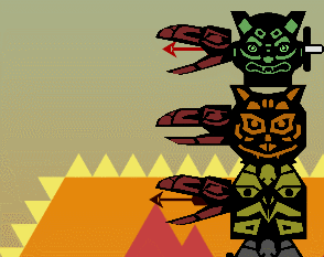
Another problem was simply telling heads apart from each other. It’s not intrinsically clear what a bear or a wolf or an eagle does or represents. Unlike, say, a scifi themed game, where the players can work things out using existing knowledge: That gun-looking structure is probably a turret, and the box that emits a glowing shield is probably a defensive mod.
Previously we’d coloured the heads according to function. Blue for defensive and orange for offensive. However, players didn’t pick up on that, viewing each head individually, and trying to work out what each did one at a time.
So we gave each one a unique colour. We also simplified the designs. A lot of detail was getting lost or creating a pixellated mess on lower resolution screens, which made the heads all blur into one. Simplifying the graphics also helped to make the overall game aesthetic look cleaner. We did the same for the enemies, using the original higher-resolution enemy images for the much larger, newly created boss enemies. This had the added bonus of making them appear more special compared to their smaller, plainer counterparts.
Hitboxes
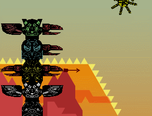
Another complaint from the launch version of the game was that the hitboxes were too small. Players would see their arrows whisk right through enemies, apparently failing to hit them unless the arrow hit dead centre. However, increasing the enemy hitbox size caused a different problem, whereupon enemies would often hit the second bottom totem head as they moved into the base of the tower. The game is programmed as such to ignore these hits (as it massively complicates the game and its coding if non-bottom heads / heads half-way through the stack can be killed). As a result, the new enemies would often completely fail to knock the totem pole down.
The solution was actually to make the arrow hitboxes significantly larger instead. Some re-balancing in other areas made sure that the game didn’t become too easy as a result.
De-confusing
Some aspects of the game didn’t get a mention in the tutorial, yet were not common features to other games in the genre. For these, rather than let the player figure it out for themselves as before, “interrupt” style tutorial messages would pop up informing the user of key bits of information the first time they did something significant but otherwise non-obvious.
For example, the placing of towers and turrets is a key part of most tower defence games, yet Totem Topple eschews this as one of the limiting factors of the game, forcing players to plan ahead a bit more than they might otherwise need to. That’s all very well except that most players didn’t understand that, especially with placing wings.
So when a wing is first placed, the game now informs the player both about the functions wings perform and where they will be placed by the game on the totem. Small graphical indicators have also been added to help players subsequently quickly see where the next wing will be placed.
Arbitrary
The other related issue is with the height warning. Way back when the game was first created, it would let players simply keep building up and up ad-infinitum. However, this meant players could for the most part mash the place head buttons (at least in frantic mode), and it didn’t really matter what heads they placed, just how quickly they could throw them down.
To get around this, a mechanic was added in which players were punished for this mode of behaviour, spawning huge waves of super-hard enemies if they built beyond the red flashing warning line near the top of their screen.
This rightly confused the hell out of most players, who did not make the connection between building “too high” and the game suddenly ramping up to impossible difficulty levels. This threat of “angering the spirits” and super-hard enemies did not raise the tension of the game as hoped. Rather, the seemingly arbitrary nature of the players’ demise just as they seemed to be making progress left many frustrated and feeling cheated.
So we simply placed a hard limit on how high players could build. No more than 10 heads, and then the first time they hit that limit, an interrupt would inform them of the limit. The red warning line was kept in, but now as a reminder of that limit rather than as an easily mis-interpreted signal of impending doom.
Sharpening Edges
The game’s UI was also subject to improvements. On the tutorial, enemies would flash and buttons “ping” and scale to help cement the messages in the tutorial text, and better guide players towards the buttons they needed to press or things they needed to be aware of.
Various factors meant we were stuck with using Unity’s less than perfect legacy GUI. However, even simple changes, like using a font other than default Arial also made a big difference. Or adjusting the UI buttons and panels to have angular corners to fit better with the angular background art style.
Overall, the various systems that help the player learn now feel like they do a much better job, working together and in different ways to convey information. There are still many more improvements to be made, but with the changes made, the game doesn’t leave players so lost and confused as it once did.